
autumn clearance
See the animations here
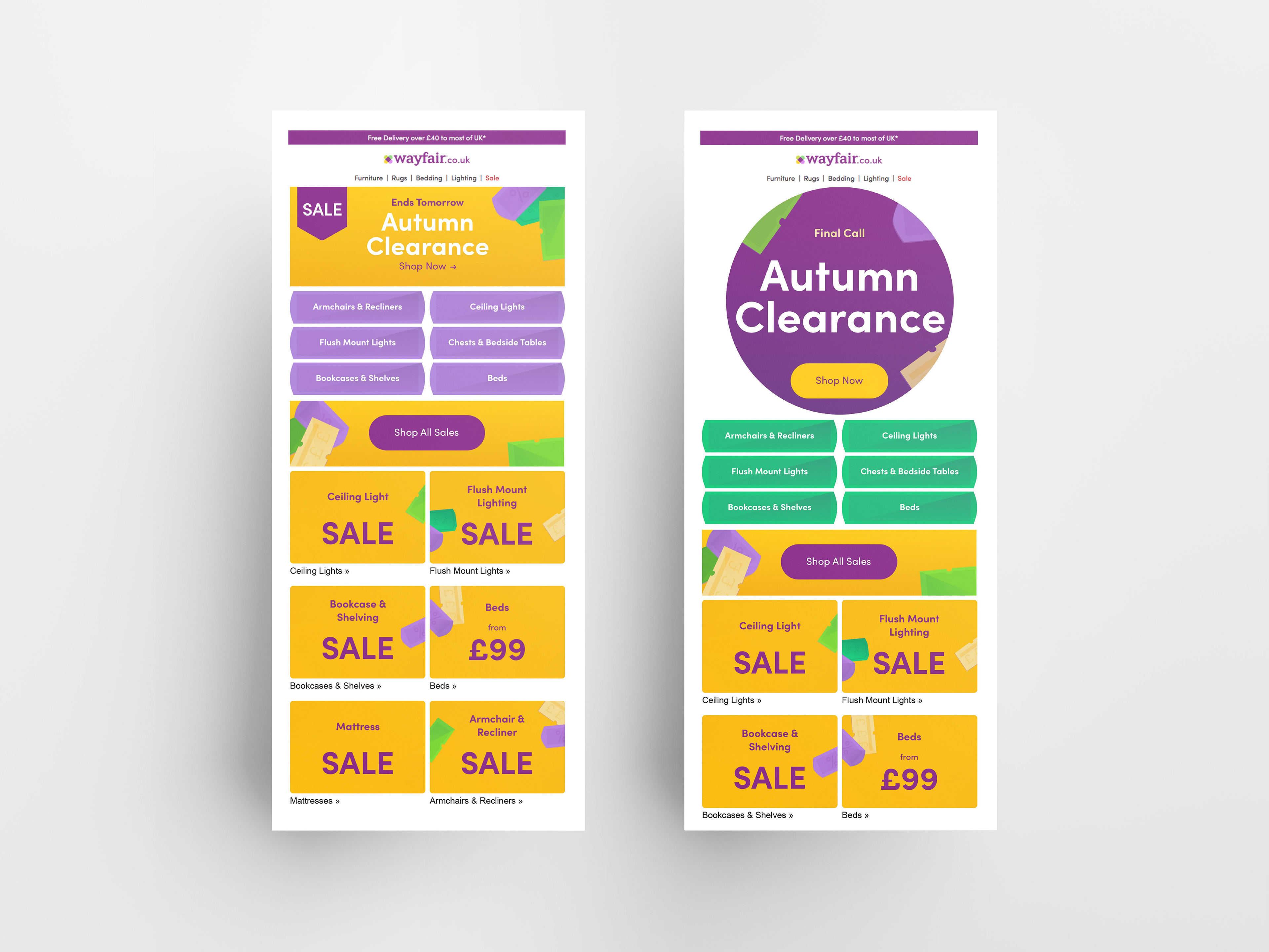
The Autumn Clearance was one of the more important clearance campaigns of the year.
The campaign ran on the site for a total of four days.
The campaign ran on the site for a total of four days.
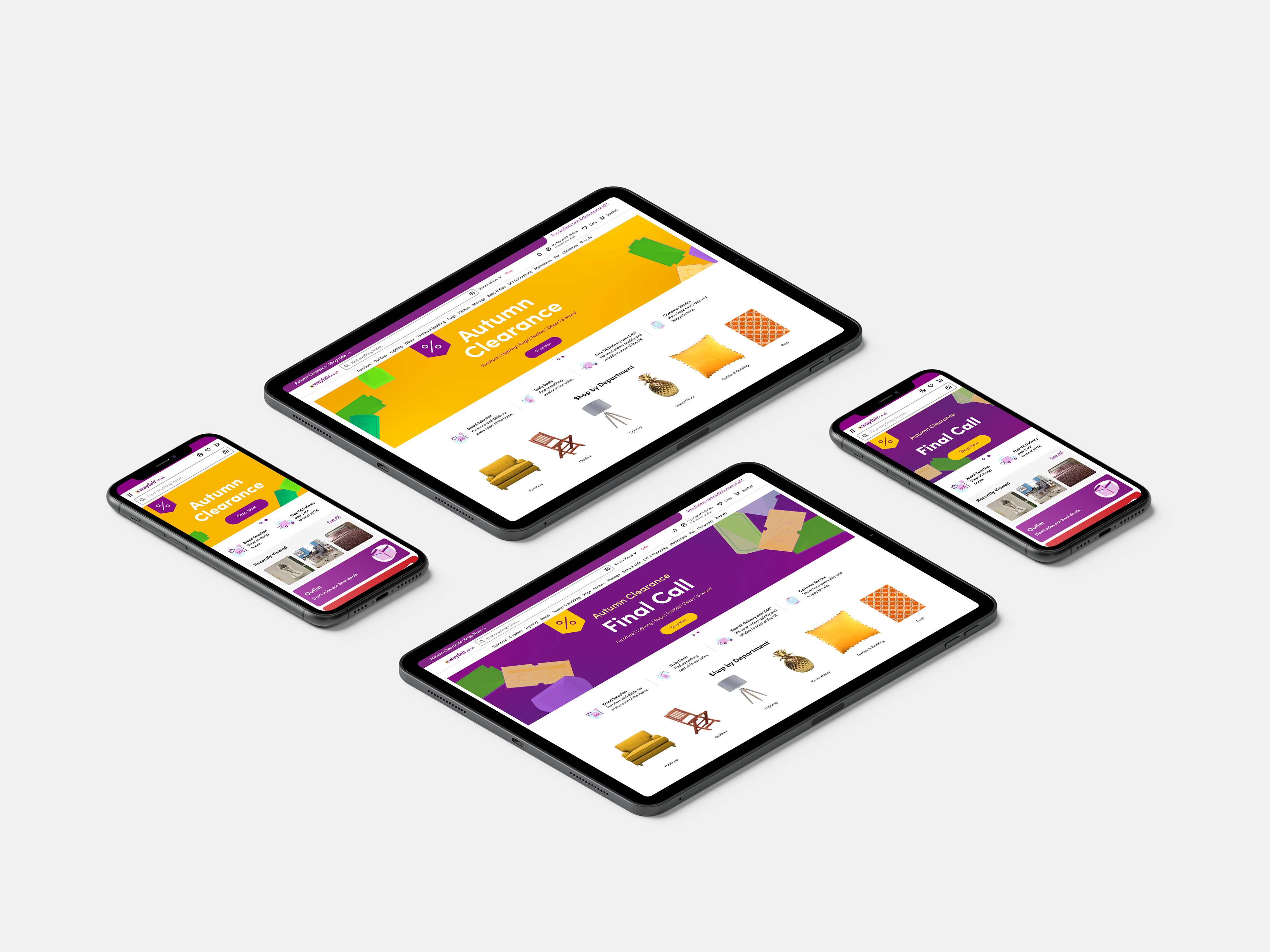
The business objective of this campaign was to confirm whether featuring existing discounts in campaigns could be a viable alternative to supplier-funded discount campaigns. The creative objective was, to use acquired best-practices with a straight-forward narrative that featured easily recognisable elements, and focused on urgency.
The creative solution to the objectives were to use the Autumns seasonality in our favour. This was done by introducing a range of soft brand colours and price stickers. The colours represented the vibrance of the season and added a more playful look. The price stickers were assembled in a minimalist way to represent accumulated tree leaves. To further drive on the urgency aspect, we introduced percentages and currency signs to the price stickers, and also as an indicator of great deals. For the last day of the sale, we included a background colour swap, which was further touching into the objective of urgency.
See the animations here
2021
outdoor must-haves
2021
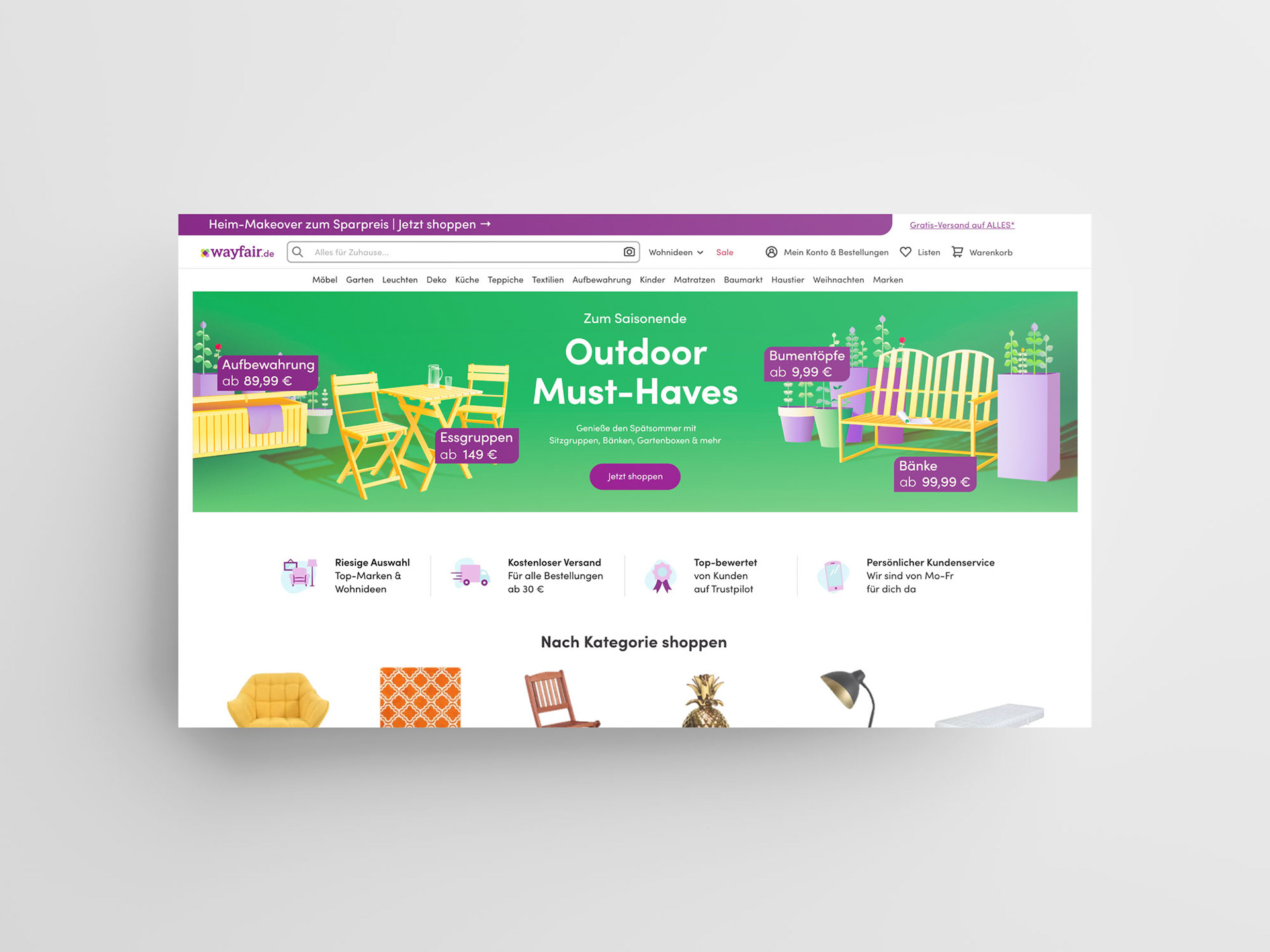
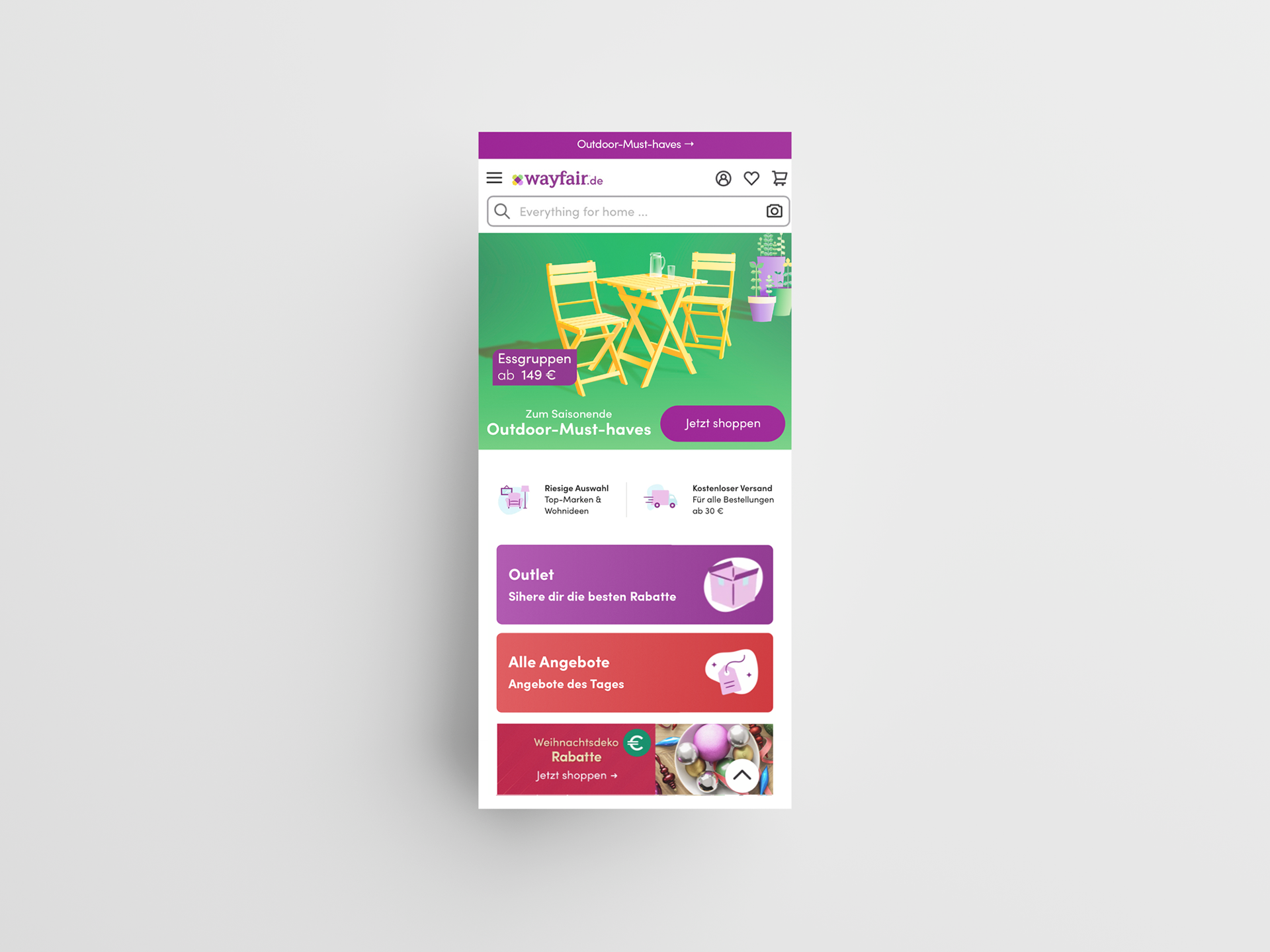
The Outdoor-Must-Haves was the sixth outdoor campaign out of seven that had a medium relevance despite being completely illustrated. The sixth iteration ran for 27 days on the site.
The business objective was to capitalise on the End of Season relevancy for key outdoor classes by promoting great prices.
The creative solution to the objectives was to use illustrated products as the main focus, because it worked well the year prior. To promote prices, we introduced a geometrical shape that housed price indicator for each class of products. Besides using green as the indicator for the outdoor environment, we were careful to select products that were outdoor-like. Extra attention was given to the positioning of the illustrated products and their shadows, to simply make an impact and show the illustrated products in appropriate manner.
2021

wall art deals
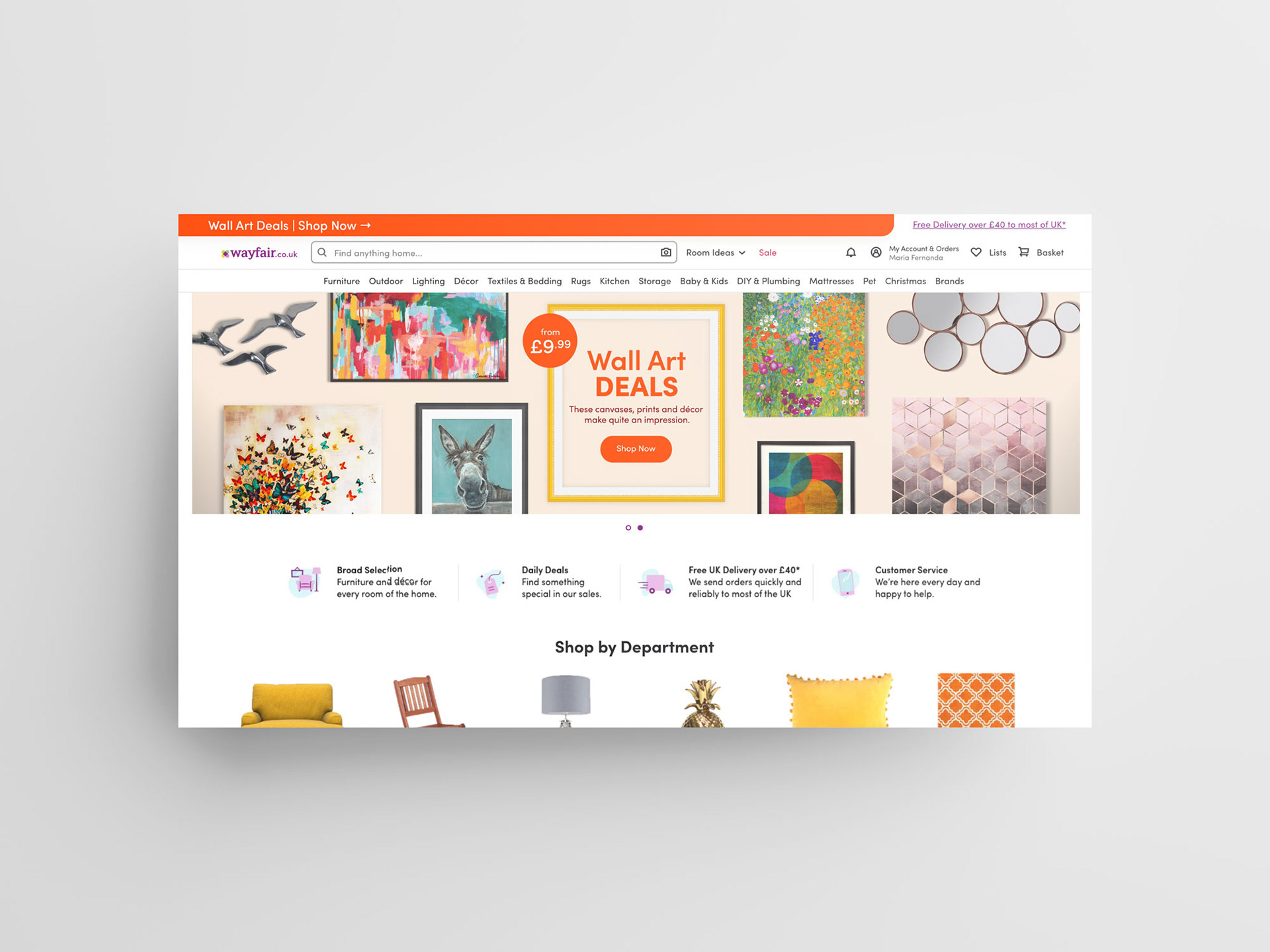
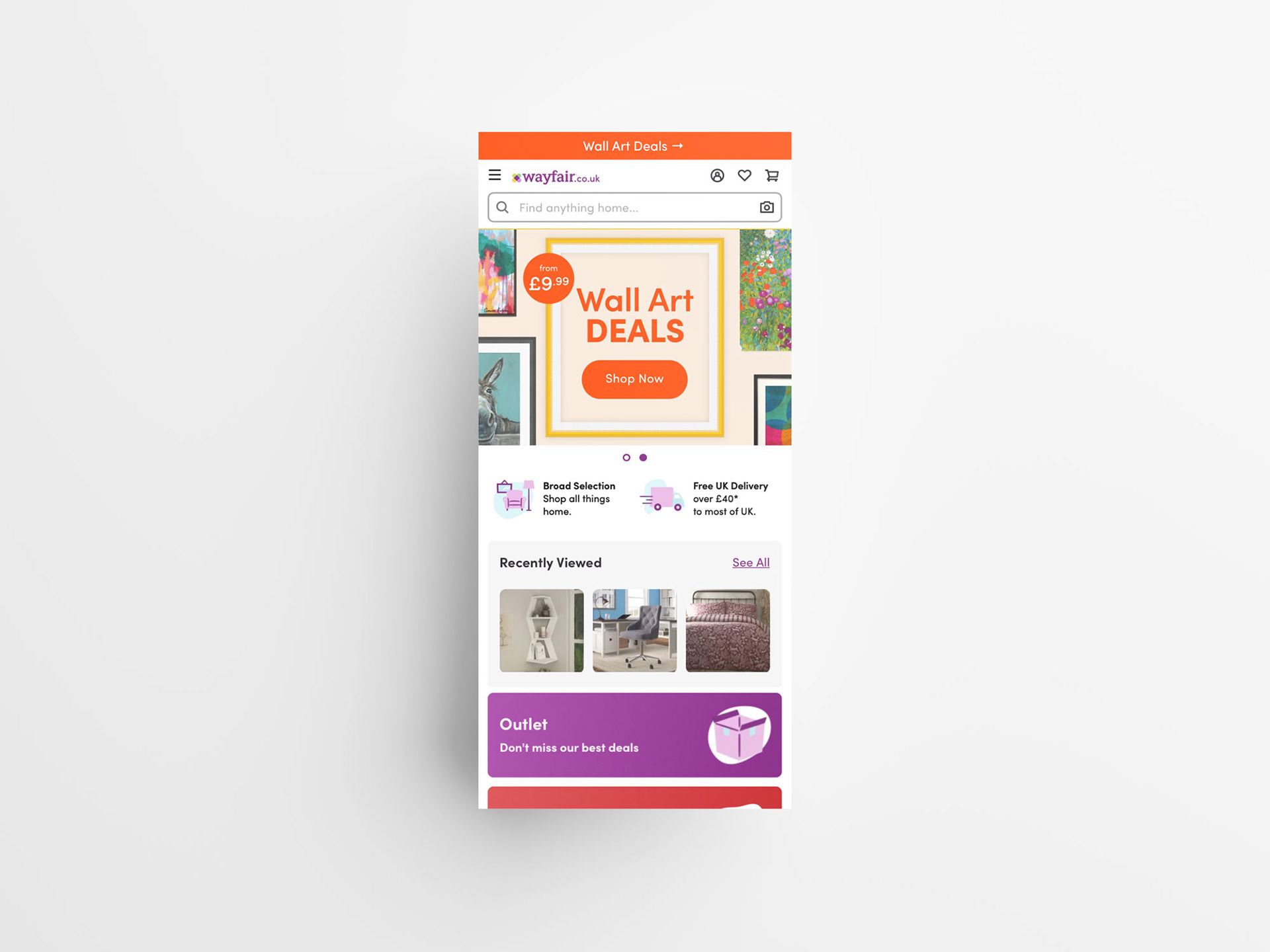
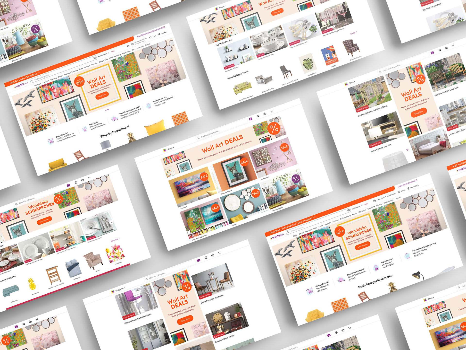
The Wall Art Deals campaign was an investment category campaign, that was part of the more casually available sales campaigns, where returns on investment was not as high. The campaign duration on the site was 12 days.
The business objective was simply to increase sales, and impact for the wall art category from previous benchmarks on homepage and email. While showcasing broad range of wall art and wall decor for any space and budget.
The creative solution leaned a lot on the ways that were done previously. The colours, product selection as well as the font treatments were directly changed. The biggest changes were in the overall aesthetic of the graphics, which was done by simplifying. We aimed not to have too many products featured and introduced more empty space between the products. We also simplified the font treatments in the middle. By using animation in our favour, we delivered the extra layer of interest and fun.
See the animations here
2020
january clearance
2021
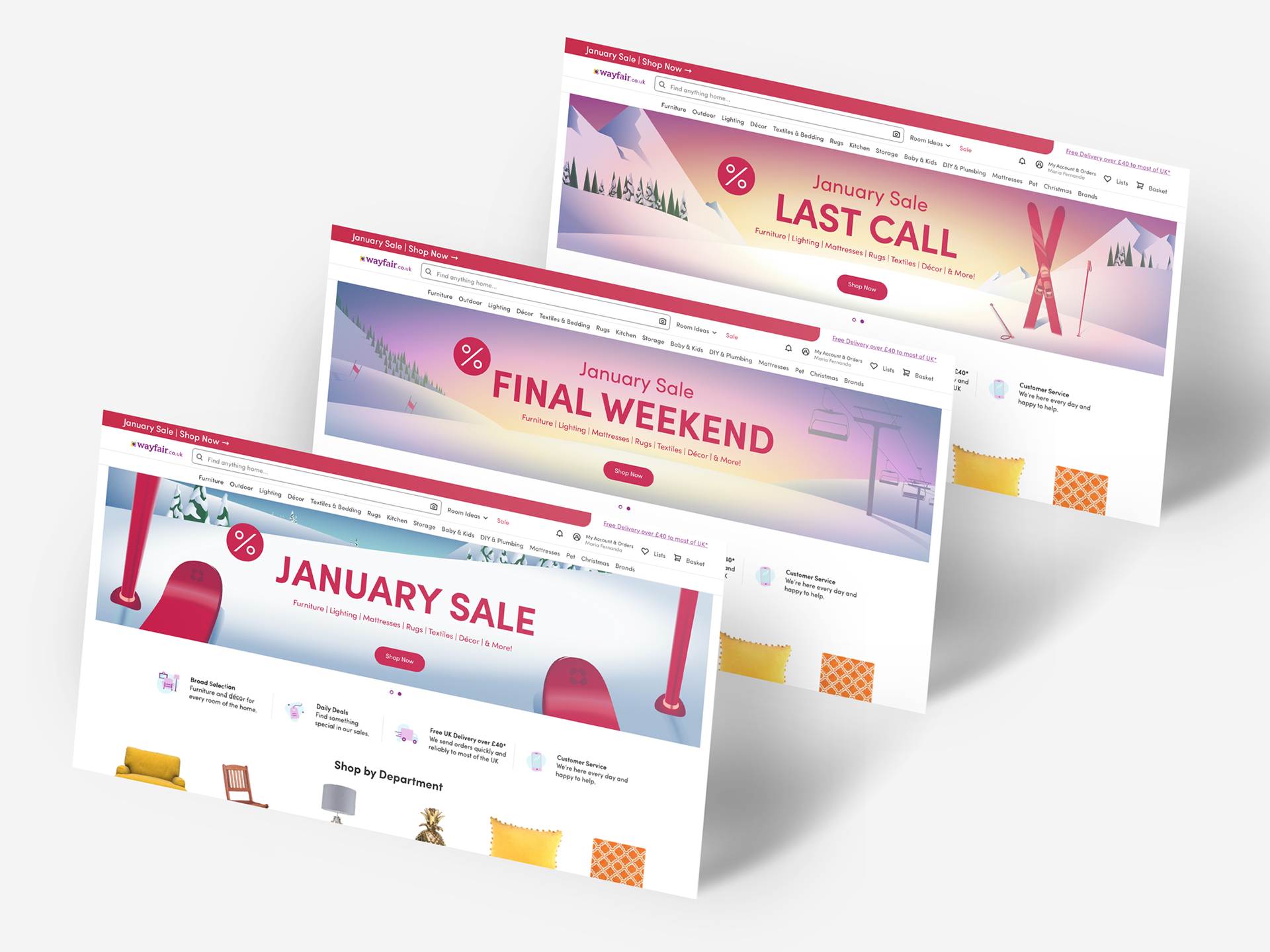
The January Clearance was the first clearance campaign of 2021 and begun right after the New Years. The campaign ran for 12 days with three creative phases incorporated.
The business objective was to start the new year in a big way and to get above average sales even after the retail holidays in December. This was further envisioned by offered discounts on products and on a strong creative approach to keep interest high.
The creative solution was to use an illustrated approach and to come up with a strong narrative story that could carry the long campaign sale with multiple iterations. Focusing on a ski trip as the narrative point, provided enough versatility for the different creative iterations. The creative iterations used different perspective, time of day and scenery to its advantage. The selected narrative also helped to distinct the creative approach from the campaigns that ran during the December retail holidays since the colour palette was in some ways inverted.
See the animations here
2021


4-day clearance
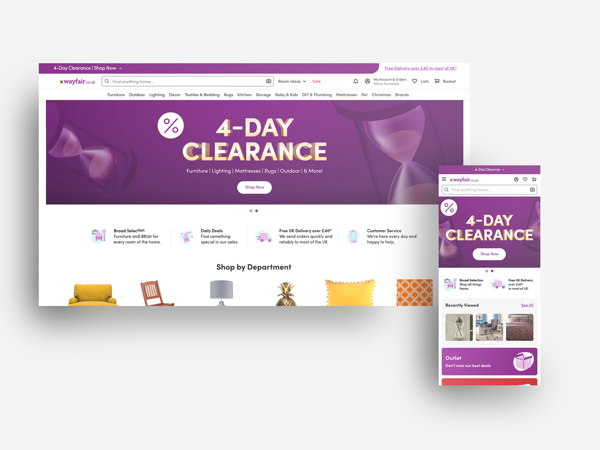
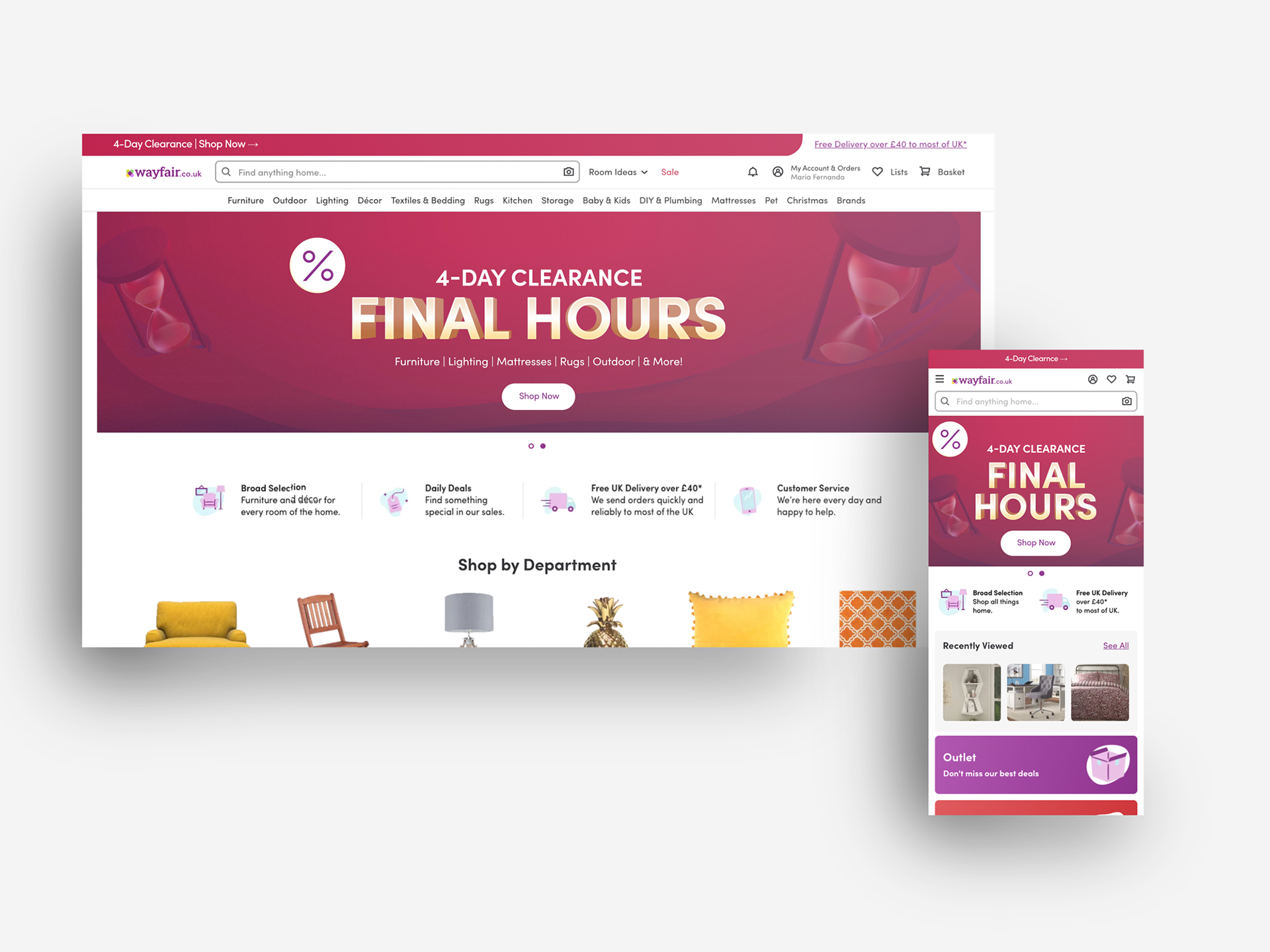
The 4-Day Clearance was a clearance campaign that was based on a tried and tested formula that spun for four days in May of 2021.
The business objective was to feature broad discounts that speak to the core customer, utilising the upcoming Bank Holiday and Clearance messaging while creating a sense of urgency.
The creative solution was to use a previously used concept of 4-Day Clearance that featured hourglasses, but to improve it in terms of colour use and animation. The hourglasses were an interpretation of a wall mounted clock, which represented the passing of time and thus inflicting urgency. The colours of the campaign were kept monotonous through out the campaign and were leaning either on brand or to red, which was a best practice at the time. Animation was also used to bring in an extra dimension and to highlight the key information.
See the animations here
2021
